Color Theory in Oil Painting: How I Use Warm and Cool to Build Worlds
Color theory is taught in art schools as a set of rules: the color wheel, complementary pairs, the difference between warm and cool. But for a working painter, color theory is not a theory at all. It is a lived practice — something you learn not from diagrams but from years of mixing oil painting colors on a palette and watching what happens when they meet on canvas.
Warm vs. Cool Colors: The Fundamental Tension
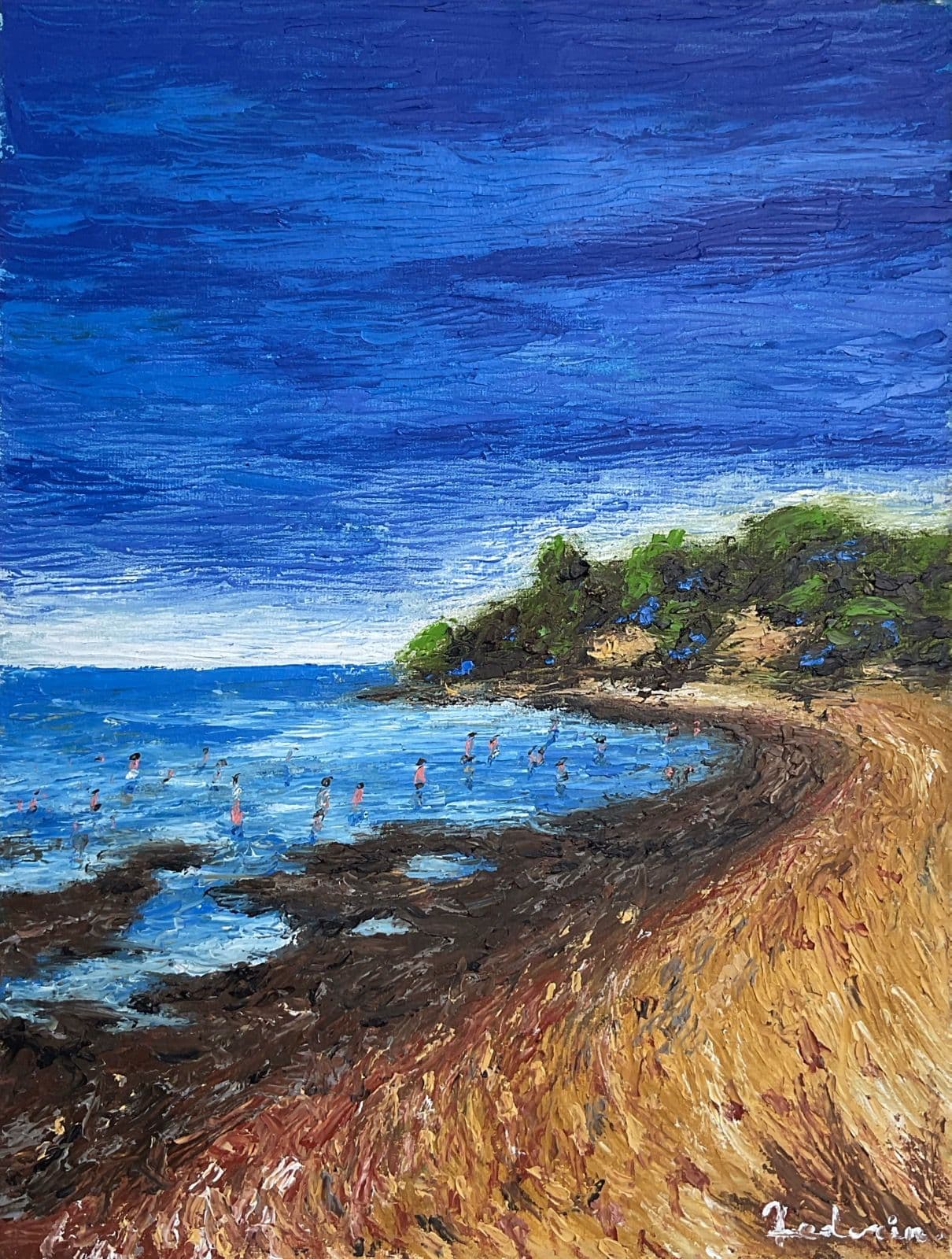
The opposition between warm and cool colors is the engine of every painting I make. Warm colors — cadmium red, yellow ochre, burnt sienna — advance. They push toward the viewer, generating heat, presence, urgency. Cool colors — ultramarine blue, viridian, raw umber in shadow — recede. They create depth, silence, distance.
In my Buenos Aires landscapes, this warm vs cool colors dynamic is extreme. The red earth of Plaza Sicilia vibrates against the blue tree trunks not because I chose those colors arbitrarily, but because the landscape itself operates on that tension. The warm ground pushes forward; the cool canopy pulls back. The eye oscillates between them, and in that oscillation, the painting breathes.
Color as Emotional Architecture
Color theory in painting is ultimately about feeling. Every color carries an emotional weight that no amount of academic description can fully capture. The rose-violet sky in Pink Buffalo does not symbolize anything specific — but it creates an atmosphere of tenderness and strangeness that the painting could not achieve in any other palette. Oil painting colors, mixed with medium and applied in varying thicknesses, produce optical effects that digital color cannot replicate.
I build my palettes intuitively but not randomly. Each painting begins with a dominant temperature — warm or cool — and then introduces its opposite as a counterforce. The resulting tension is what gives the image its life. A painting that is all warm is aggressive. A painting that is all cool is remote. The art is in the dialogue between them.
The Colors I Cannot Live Without
After twenty years of painting, my essential palette has narrowed to perhaps a dozen pigments. Titanium white, ivory black, cadmium yellow, yellow ochre, cadmium red, alizarin crimson, burnt sienna, raw umber, ultramarine blue, cerulean blue, viridian. From these, every color in my work is mixed. The limitation is not a constraint — it is a discipline. When you know your pigments intimately, color theory ceases to be theory and becomes instinct.